I find where users get confused or drop off in a product and improve the user experience, from the first screen to payment and everyday use.

I've worked as a product designer since 2017, mostly on consumer products: a bank, a film and TV streaming service, a betting and sports stats platform, and a few products of my own.

Before that I went to art school, then studied architecture at university, and after graduating worked for three years as a graphic designer. Visual work has been part of my job from the start, alongside flows and numbers.

Personal projects2021–now

TransferMusiciOSCo-founder, sole designer2021 – now

An iOS app that transfers your music library from one streaming service to another

Video: the app from opening to a finished transfer
★★★★★

Amazing

kazper999 · 3 March 2026

Took me maybe 10 total minutes from downloading to seeing the music in my library. Amazing app and quick

I've been the only designer since the first version, and the developer and I decide together where the app goes. Reviews often say the app is quick and easy to use, which comes from years of small UX fixes.

  • 4.5★16K+ ratings
  • +63%revenue after a one-tier price increase
  • 32store locales

Loading states

A transfer goes through several stages, and all of them involve waiting, so I designed a separate loader for each. I kept reworking the progress bar until users stopped asking how the transfer works.

Artists, albums, podcasts

Research showed that people wanted to move their whole library, not just playlists, so we added artists, albums and podcasts. This became one of our advantages over competitors.

Onboarding

Explanations appear only where people can't do without them, for example why some tracks can't be transferred, or why the destination service needs a subscription.

Pricing

We tested price changes. Raising the transfer price by one tier increased revenue by 63%. Raising it further, to the third tier, gave no statistically significant growth in revenue and lowered downloads.

Store screenshots

I used Claude Code to localise the App Store screenshots for each market, showing the albums and artists that are popular in that particular market. Downloads grew 8%.
TransferMusic on the App Store

RefCatiOSDesigner, with one developer2026

App design in three days for a hackathon

Video: onboarding and the camera with a reference on top

RefCat puts a reference photo over the camera, so you can repeat a pose or a framing you like. For RevenueCat's Shipaton hackathon I reworked the UX of an early version of the app.

Who looks at the screen

The person taking the photo watches the overlay and directs the person posing, who never sees the screen. So the overlay and controls are designed for whoever is recreating the reference.

Onboarding with Claude Design

While I was reworking the app's UX, I had Claude Design build the onboarding to save time. I supervised it, and after a few rounds of edits the onboarding was ready.

Why a cat

The name, the onboarding and the branding are built around a cat. Cats look good in any pose, and the app is all about poses.

RefCat on the App Store

Company work2017–2026

AdleteWebFounding product designer2025 – 2026

A sports startup that changed direction after its first MVP

Video: the registration and payment flow

Adlete started as a portfolio site where athletes present themselves to sponsors. The video shows that first version, which I designed.

  • 250athletes in the first 2 months
  • 2,000Instagram followers

Why we changed direction

Athletes signed up quickly, but getting brands on board took a lot of sales work, and the team didn't have the resources for it.

Second version

While the first version was live, many young athletes and sports specialists came to our social media. Young athletes lacked expert advice, so the second version connected them with specialists. It was cheaper to build and run. 25 users paid €40 a month. Retention was 45% in month 2 and 28% in month 3.

Registration form

Our lawyer insisted on a long registration form, saying it was the only option allowed in Romania. I found popular Romanian sites with short forms, but the long one went into the first version anyway. It put people off signing up, so we agreed to run an A/B test. The short form won, the lawyer looked at the requirements again, and we switched to it.

The project has since closed.

viju (Viasat)Streaming service · Web, iOS, Android, Smart TVLead product designer2023 – 2025

A streaming service on four platforms

Video: sign-up to subscription, the player and the TV interface

viju is the streaming service of Viasat's pay-TV group in Russia. I redesigned the whole flow from sign-up to a paid subscription, reworked the video player and merged the design systems of all four platforms into one.

  • +12%subscription conversion, prices unchanged
  • 18–25%longer viewing after the player redesign (before and after, no A/B test)

Sign-up to subscription

I audited the whole flow, went through the tricky parts with the system analysts and the implementation options with the engineers, then redesigned sign-up, login, promo codes, partner offers and edge cases as one journey. Subscription conversion went up 12% without any change to prices. After I left, the team tried to design a new version that would convert better, but mine is still in production.

Design system

Web, iOS, Android and TV each had their own components. I unified them into one library with shared tokens, and built in contrast, focus states and text scaling.

TV remote

I designed a remote control inside the phone app, so people can pick and play films on the TV from their phone, without a physical remote. I took it from the first concept to production. No Russian streaming service had anything like it at the time, so I had to design something users had never seen before.

Team

I took over a product design team of four designers. I parted ways with one of them after a year and hired two more. I mentored three designers on the team. I also made user research part of planning. When I joined, other departments rated the design team's work 6.4 out of 10. By the time I left, the rating was 8.1.

viju.ru

FonbetWeb, iOS, Android2019 – 2023

Sign-up and payments for 1.5M monthly users

Video: Fonbet app
World Cup screen, made by the whole team. My part: the odds tables and leading the designers.

Fonbet is Russia's largest betting operator. I joined as a senior designer and became the product design team lead within a year.

  • 1.5Mmonthly users
  • 3new markets

iOS app and design system

I redesigned the iOS app and built its design system from scratch. Later it grew into one system for web, iOS and Android, used by every product team.

Odds catalogue

The odds were shown in tables that even the team found hard to read. Together with the engineers, I turned them into documented components built on tokens. In interviews, 90% of users said the new version was easier to read.

Registration and identity verification

I redesigned sign-up together with identity verification (KYC), which betting law requires before the first bet.

Payments

We moved to a new payment provider. I redesigned the payment flow, added new payment methods and shortened the time to the first deposit.

New markets

I adapted the product for Uzbekistan, Cyprus and Belarus: language, local payment methods and the legal rules of each country.

Team

I led a team of four designers and set up a development plan for each of them. All three juniors grew to mid-level.

Fonbet on the App Store (Russia)

Pochta BankMobile and web banking2018 – 2019

A loan application in 2 minutes instead of 8

Video: transaction history

Loan application

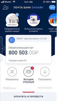
I redesigned the loan and credit card application, adding a calculator, personal offers and card comparison. Filling it in now takes 2 minutes instead of 8.

Transaction history

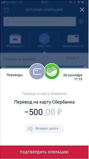
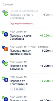
I built a catalog of every operation the bank had: its type, category, icon and states, and how it looks in each part of the app, from transaction history to the operation screen and the notification. I also rewrote the operation names to make them shorter and clearer, and got them signed off by the business analyst.

Stories

I launched stories in the bank's app. At the time only one competing bank had them. They had to be simple and useful: one content creator had to be able to run them instead of a 10-person content team, heavy graphics couldn't slow down the app, and they had to support different kinds of news.

Pochta Bank merged into VTB in 2026, so this version of the product is no longer online.